Here you can find detailed information about the installation, configuration and special features of Zeus VirtueMart template. Use the menu on the left side to quickly navigate to the documentation's main sections.
Template installation
To install the template :
- Login to Joomla administration area.
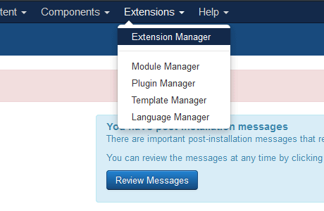
- Go to "Extensions -> Extension Manager".
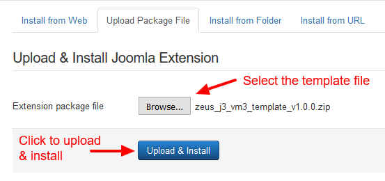
- In the "Upload Package File" field find the template file that you downloaded from our web site and hit the "Upload & Install" button.
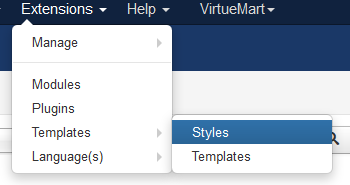
- Go to "Extensions -> Template-> Styles" and set the template as default.

Updating the template
FIRST BACKUP YOUR TEMPLATE FILES
The update process is simple, you just reinstall the new version over the existing. The installation will not overwrite the custom.css file so your code changes will remain intact.
In case you had modified any template files, you will have to replace the new files with the modified or redo the modification to the new files.
Quickstart package installation
To install the quick start package follow these steps:
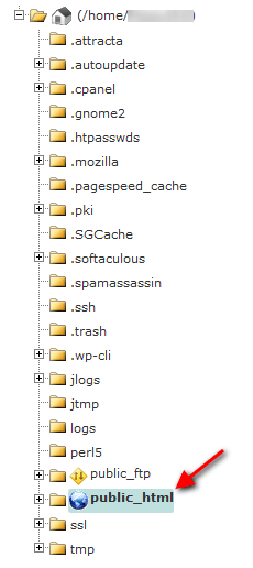
- Upload the zeus_j3_vm3_QS_v1.0.0.zip to your server's www root folder (public_html on Cpanel servers).
- Extract the file.
- Open your favorite browser and type your domain name.
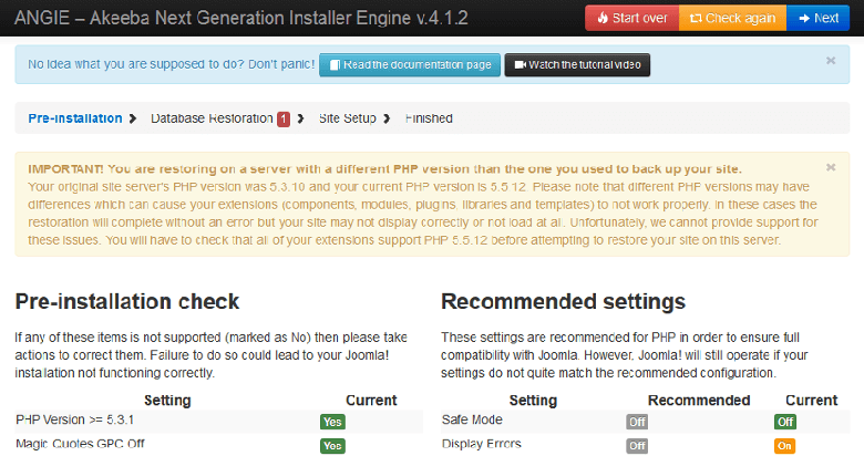
- The quick start installation page will appear.
Before installing on a live server you should first create a database and a database user because the installer will ask for this information.
General settings
In the general settings tab of the template configuration page you can find several settings for the basic configuration of the template.
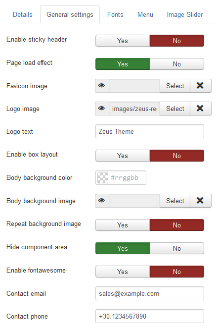
- Enable sticky header
- When enabled the header will follow when you scroll down the page.
- Page load effect
- When enabled a page loading effect will display until all page elements are loaded.
- Favicon image
- You can easily select or upload your favicon.
- Logo image
- You can select or upload your logo image.
- Logo text
- You can input a text here that will be used as a logo. This can be used only when no image logo is defined.
- Enable box layout
- When enabled all template's main sections are centered with a max-width of 1170px.
- Body background color
- You can set here the main background color of the template.
- Body background image
- You can set here a background image for the template.
- Repeat background image
- When enabled the background image will be repeated.
- Hide component area
- When enabled the component area will be hidden on the front page. This is useful when you want to build your home page only with modules.
- Enable fontawesome
- When enabled the fontawesome css will be loaded so you can use the icons in your content.
- Contact email
- You can enter here the email that will be displayed on the toolbar section of the template.
- Contact phone
- You can enter here the phone that will be displayed on the toolbar section of the template.
Fonts
In the "Fonts" tab of the template's settings page you can find several options to change the fonts size, color and font family.
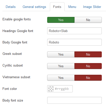
It is possible to use Google fonts also by enabling first the "Enable google fonts" option and then enter the Google font name in "Headings Google font" or "Body Google font" input fields. To use the same Google font for body and heading you only need to enter the font name in the "Body Google font" input field. If the font name has two words i.e. "Open Sans" you must replace the space between the words with the "+" symbol "Open+Sans".
Drop down menu
In order to display the main menu find your desired menu module, set the position to "menu" and select "YES" in "Always Show Submenu Items".
The module caching must be disabled or else the mobile menu will not display.
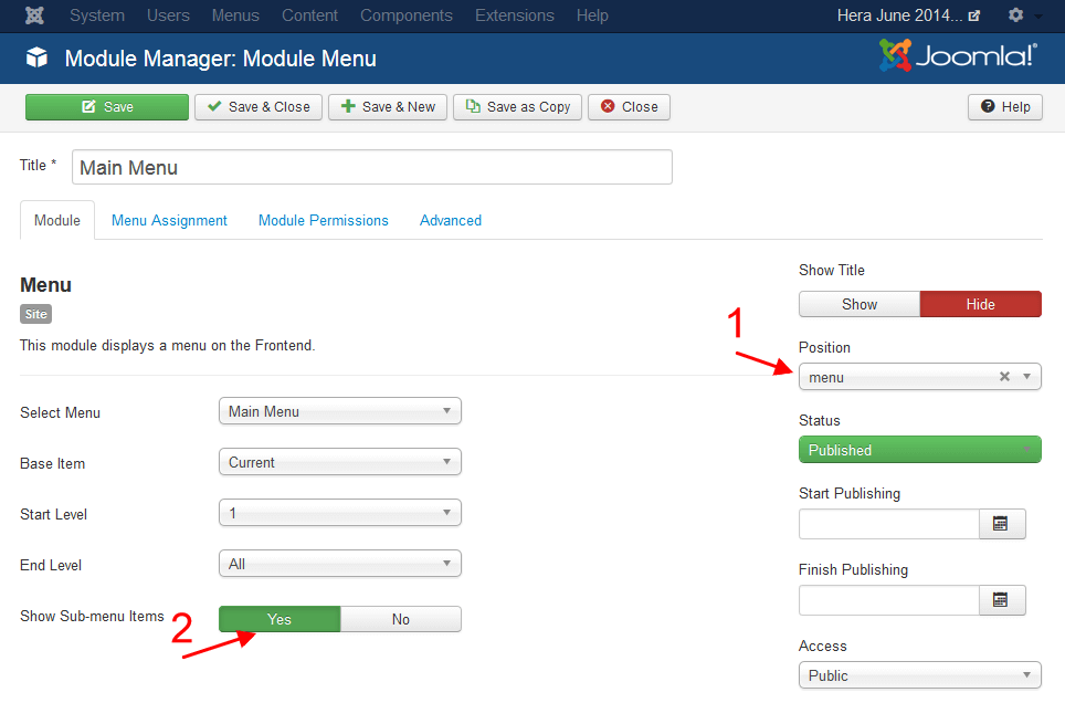
Drop down menu settings
You have two main settings for the droop down menu:
- The delay of hiding the sub-menus in milliseconds
- The effect of the display of sub-menus. Default behavior is fade in.

Mega menu
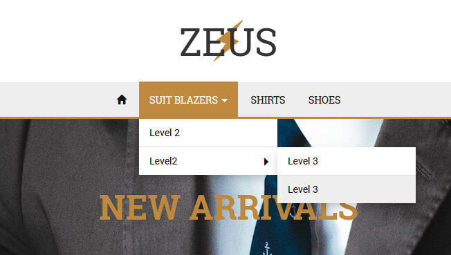
Creating a mega menu is very easy, all you have to do is add the class "mega" in the "Link CSS Style" parameter of the top level menu item. The mega menu supports only 3 levels.
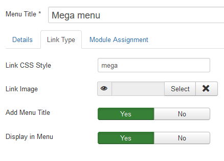
Adding an image banner as menu item
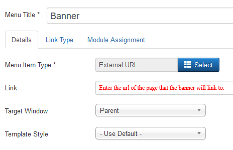
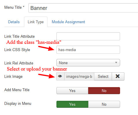
To use an image banner in your mega menu you need to create a second level menu item, type of "External URL". In the "Link type" tab add the class "has-media" in the "Link CSS Style" parameter field and select or upload your banner using the media manager of the "Link Image" parameter field.
Adding a youtube video as menu item
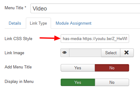
To use a youtube video in your mega menu you need to create a second level menu item, type of "Text Separator". In the "Link type" tab add the class "has-media" and the youtube share video URL in the "Link CSS Style" parameter field.
Menu customization
It is very simple to customize the menu appearance, the template provides many options to apply custom colors for the text, backgrounds and borders. You can either directly enter the color hex code in the available input fields or use the color picker of each field to select a color.

Display a module in the menu
Since version 1.3.3 you can display a module as a menu item. To use this feature do the following:
- Create the desired module and set it to display on all pages but don't set a module position
- On the modules page check what is the id of this module
- Create a new menu item and select "System Links -> Separator" in "Menu item type" field
- While on the menu item page click the "Link type" tab and enter in the "Link Class" field the text "mod-ID" where ID must be the id of the module you created before, e.g. mod-134
Module positions
| Module position | Available on Devices |
|---|---|
| toolbar-l | All |
| toolbar-c | All |
| toolbar-r | All |
| currencies | All |
| languages | All |
| header | All |
| header-m | All |
| search | All |
| cart | All |
| menu | All |
| slider | All |
| breadcrumbs | All |
| top-1 | Desktop only |
| top-2 | Desktop only |
| top-3 | Desktop only |
| mobile-top | Mobiles only |
| content-top | Desktop only |
| content-bottom | Desktop only |
| left | Desktop only |
| right | Desktop only |
| mobile-bottom | Mobiles only |
| bottom-1 | Desktop only |
| bottom-2 | Desktop only |
| bottom-3 | Desktop only |
| footer | All |
| footer-menu | All |
| debug | All |
Modules width
By default all modules will have 100% width but you can set the specific width per module so you can have the number of modules per row you like. The width of each module can be set in the "Advanced" tab of the module's configuration page.
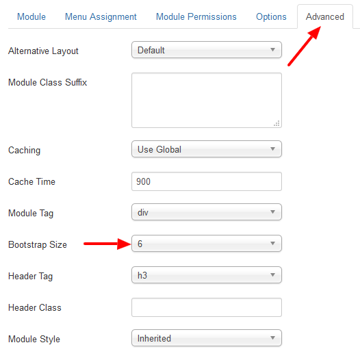
The size is based on the Bootstrap grid with a range of 0 (default) to 12. For example to display two modules on a position with 50% width each, you must set the "Bootstrap Size" option to 6 for each module. The sum of all modules on a position must always be 12. Lets say you want to display 4 modules on a position in the same row, then you must set the "Bootstrap Size" for each module to 3.
Module variations
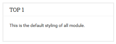
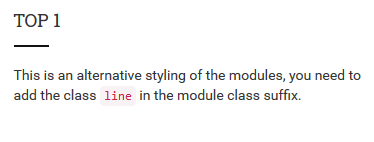
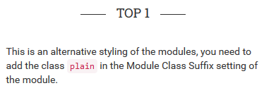
The modules have 3 styles, default, line and plain. All modules will have the default style if no style class is applied, to change the style you need to add the "line" or "plain" class in the "Module Class Suffix" field of the module.

Default style
Line style
Plain style
General customization
A good practice when you want to change the styling of the template is to use the available customization options of the template and when there are no options for the elements you want to change use the custom.css file or the "Custom inline code" option. This way you will avoid problems with future updates because all your customizations will remain intact. Never ever modify the core css files so you can keep the template's update process fast and simple.
In the "Layout & Colors" tab of the template's configuration page you will find several options to customize the styling per section with a few clicks.
Custom CSS file
When you need to change the styling of elements or sections that are not possible to be changed by the available customization options create a custom.css file in the templates\zeus\css folder. This file is loaded always last so it can override all the default styling. First you add all your custom css code in this file and then you enable the use of the file from the "Custom css/js" tab of the template's configuration page.
If the changes are few it is better to use the "Custom Inline css" option instead to avoid unnecessary file requests.
Custom inline CSS
When you have small css changes you can add your code directly in the "Custom inline css" field that is available in the "Custom css/js" tab of the template's configuration page. Your code will not be deleted by future template updates.
Custom js code
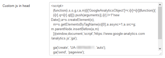
For custom or 3party javascript code (analytics, heatmaps, chat etc) the template provides 2 options, "Custom js in head" and "Custom js in body". These fields are available in the "Custom css/js" tab of the template's configuration page. This type of code must be added with the script tags also.
Product category list layout
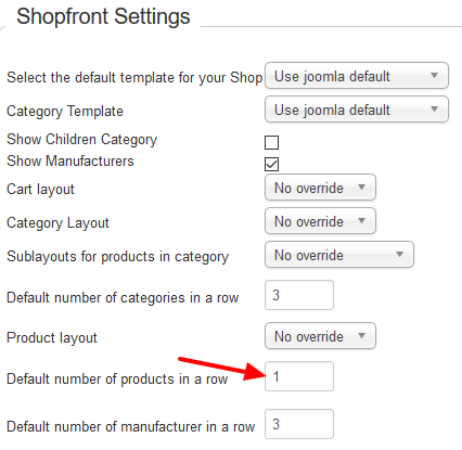
If you like to display the products on all category pages as a list, you have to set the option "Default number of products in a row" to 1 in VirtueMart configuration.
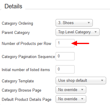
To set the list layout only to specific category, you have to set the option "Default number of products in a row" to 1 in the specific category.
Manufacturers carousel
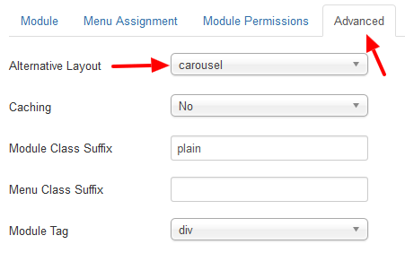
The manufacturers module has an alternative layout available so you can create a carousel. Go to VirtueMart Manufacturers module and set:
- VirtueMart Manufacturer = Thumb image
- Display style = Div based
- Manufacturers per row = The number you like

Now in "Advanced" tab set the "Alternative Layout" drop down to "carousel".
Products module
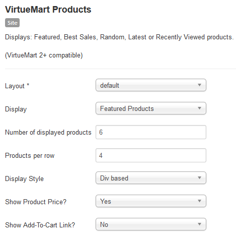
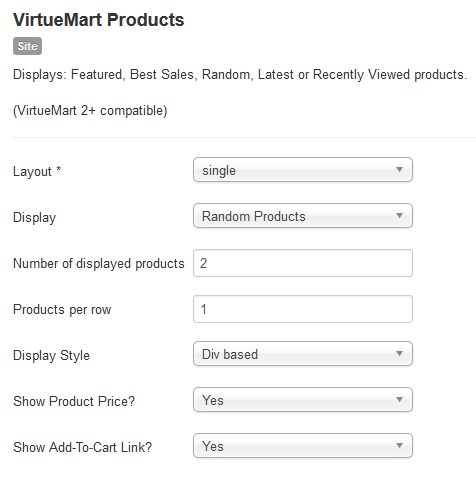
The VirtueMart products module has two available layouts:
- "default" layout will display the products in a carousel.
- "single" layout will display the products in a list, useful when you want to use the module on the sidebars of the template.
Example with "default" layout
Example with "single" layout
VirtueMart categories tree in the menu
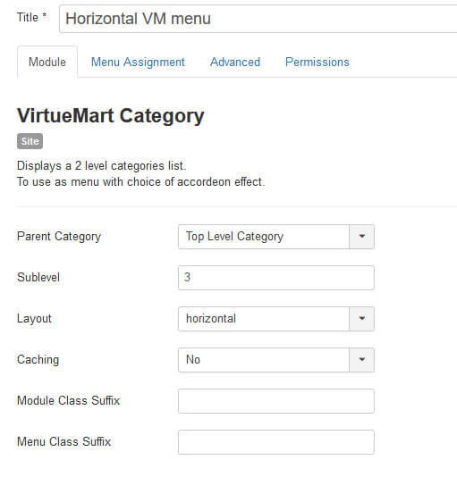
The template has a special layout for the VirtueMart categories module so you can display a 3 level drop down menu in the menu module position.
To achieve this, create or use an existing VirtueMart categories module and :
- Set the "Parent Category" to "Top Level Category"
- Set the "Sublevel" to 3
- Set the "Layout" to "horizontal"
- Set the "Position" to "menu"
Webmaster tools
The template provides options to add the Google and Bing webmaster tools meta tags. In the "Search engines" tab of the template's configuration page you will find two fields were you can add your owner verification ID.

Image slider
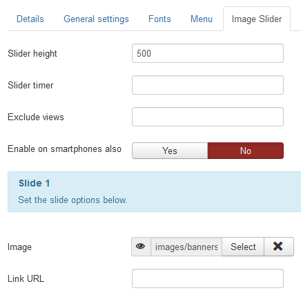
The template has a built in home page responsive image slider that can support up to 5 images with links. The available settings are:
- Slider height
- Set the height of the slider container. This must be equal to your images height. Make sure you are using images of the same height for all your slides.
- Slider timer
- Set the time interval in milliseconds (i.e. 1000 for 1 sec) that the slides will change.
- Exclude views
- Enter a comma separated list of views to exclude the display of the built in image slider.
- Enable on smartphones also
- By default the image slider will not display on smartphones for faster page load.
Auto embed videos
Adding youtube and Vimeo videos in your content is very simple, all you have to do is:
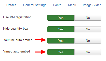
- Enable the "Youtube auto embed" or "Vimeo auto embed" settings that are available in the "Extras" tab of the template's configuration page.
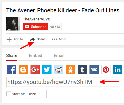
- Copy the video share url from the video's page and paste it in the editor.
